
Data visualisation
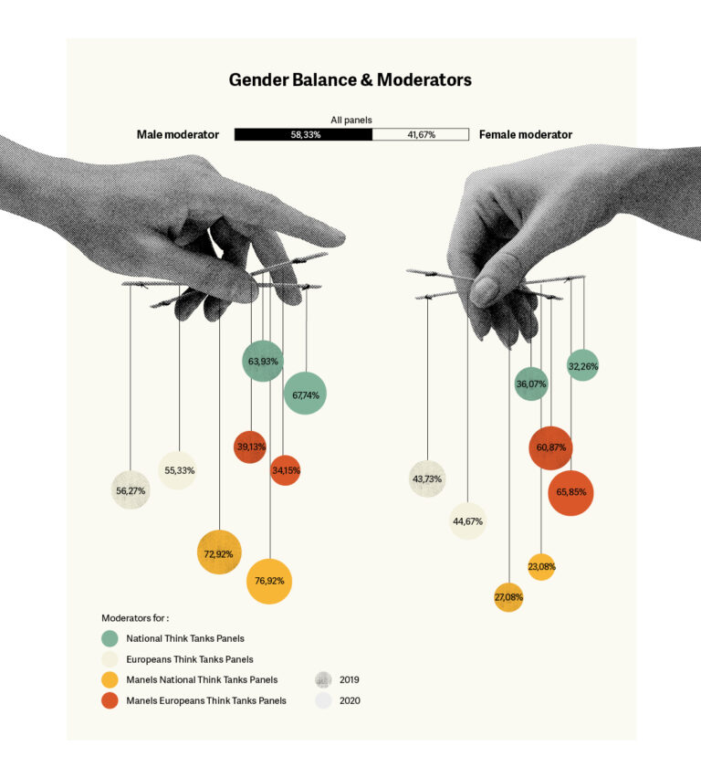
Data visualisation for a report on the role of women in public events (panels, conferences, etc.)
Stand out from the crowd!
Transform raw data – set out in an Excel table – into beautiful, understandable and high-impact images with data visualisation. Claire Allard, a print graphic designer in Brussels, will help you to optimise your visual communication and convey your messages more easily through the use of diagrams, charts and aesthetic graphics.
What is data visualisation?
Data visualisation is a set of methods making it possible to summarise data in a graphic format.
Our brains need visual stimulus to process, absorb and interpret large quantities of information. Data visualisation visually and interactively explores data of all sizes, types and origins, and represents them graphically.
Raw information can say a thousand and one things and can be pretty hard to process. Visualisations help to see things which were not necessarily evident before. That seemed abstract. However, even when the volume of data is significant, trends can be seen quickly and simply. Visualisation makes it possible to convey information and helps to share ideas with others.
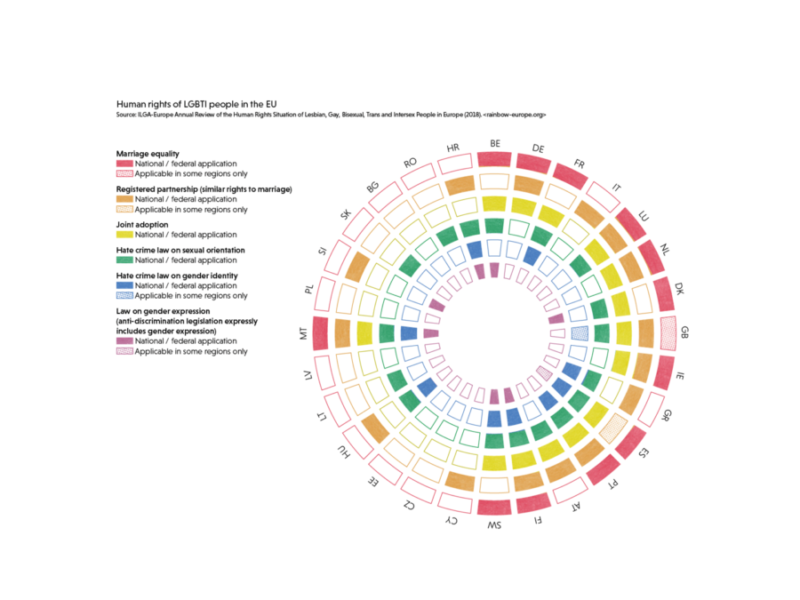
Visualisation de données sur les droits LBGTQIA+ en Europe
Data visualisation to simplify complex messages
My work as a print graphic designer is to transform and create page layouts for indigestible documents and turning into easily understandable pieces. Through the use of visuals, I handle the page layout of your documents and simplify them with visualisation. Please note! There are many more graphic forms than just pie charts! Data visualisation can take the form of graphics, diagrams and even maps. Data visualisation makes it possible to understand subjective data through sensitive mapping, for example.
A graphic designer to create data visualisation?
Do you feel overwhelmed faced with a document full of information? Are you struggling with how to organise ideas to make them intelligible? As a Print Graphic Designer in Brussels, I can help you work through your content, organise information and structure the data through graphic visualisation. The result? A document that flows, is enjoyable to read, aesthetically pleasing and relays a high-impact message.
The advantages of data visualisation
- Graphic representation that is easy to understand and share
- Time saving for the reader
- Intelligent reading of information
- Better understanding of the message
- Intelligent illustration
- Wow factor!
Why choose me?
- Able to see the bigger picture
- Creativity
- Aesthetics
- Meticulousness
- Good listening skills
- Organisation
I began offering this service following a workshop with Stefanie Posavec (#deardata), specialist in analogue data visualisation and training with David McCandless (#informationisbeautiful), information design specialist.
Would you like to make your data easy to understand for reports, social networks and other communications?
Please contact us!
Fill out the quote request form and we can discuss your project.